Da Paolo
Gastronomia

Da Paolo Gastronomia
01/
Type
F&B Branding
& Interior
Da Paolo Group
client
2021 – 2025
YEAR
Great World City, Singapore
Project Story
Da Paolo Group, started in 1989 by Paolo and Judie Scarpa with a Trattoria serving honest and uncomplicated Italian fare, has evolved since then to encompass several concepts and locations across Singapore. Da Paolo’s core values of quality and authenticity remain strong, and the business is still own and operated by the family.
SCOPE
Strategy
Brand Identity
Art Direction
Packaging
ROLE
Led visual direction across brand and marketing, ensuring cohesive, consistent execution across all touchpoints
Location
Great World City
Marina Bay Sands (Roll-out)
Raffles City (Roll-out)
Bukit Timah (Roll-out)
Holland Village (Roll-out)
Orchard Paragon (Roll-out)
The Brief
Reimagine a beloved Italian institution for today's retail landscape.
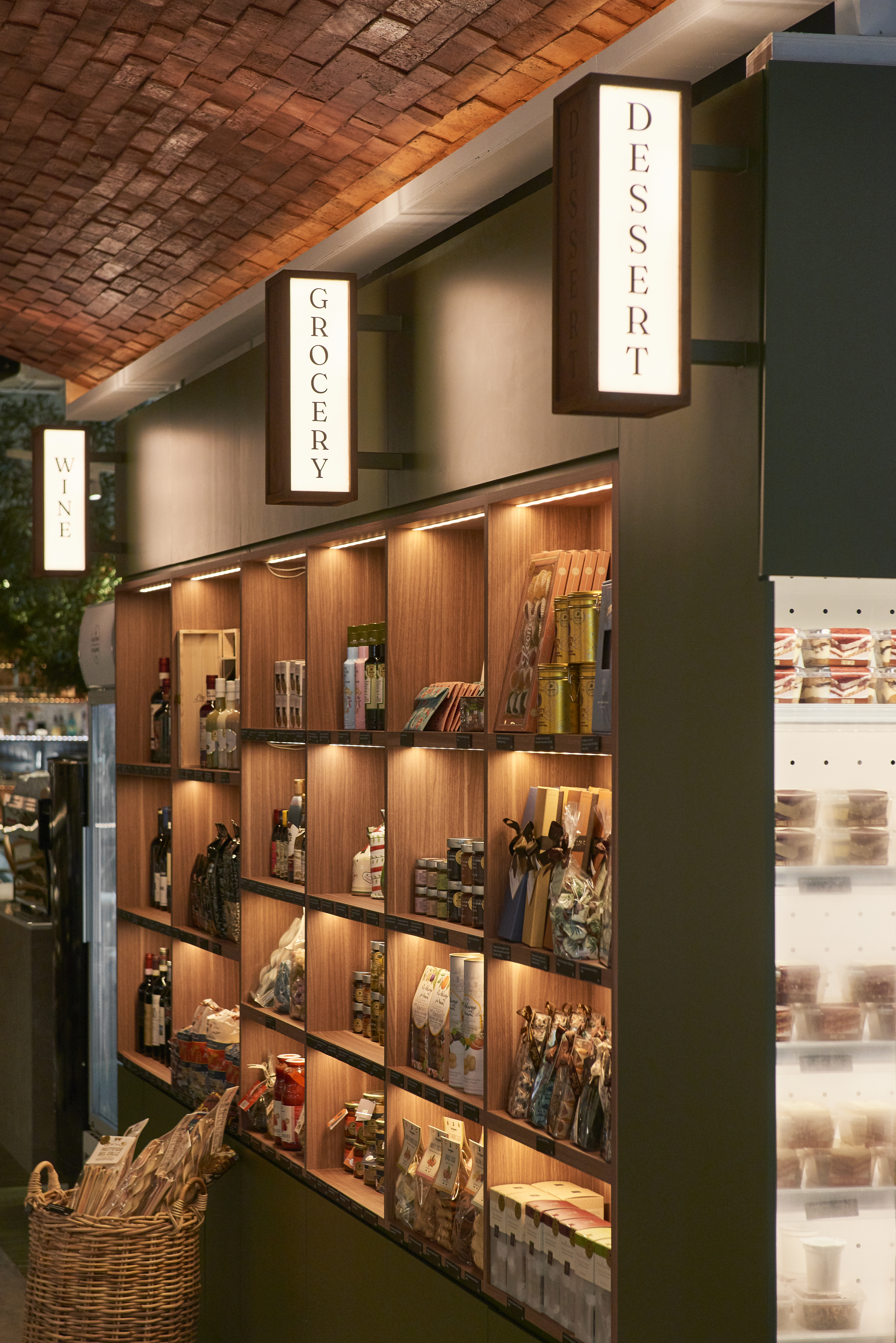
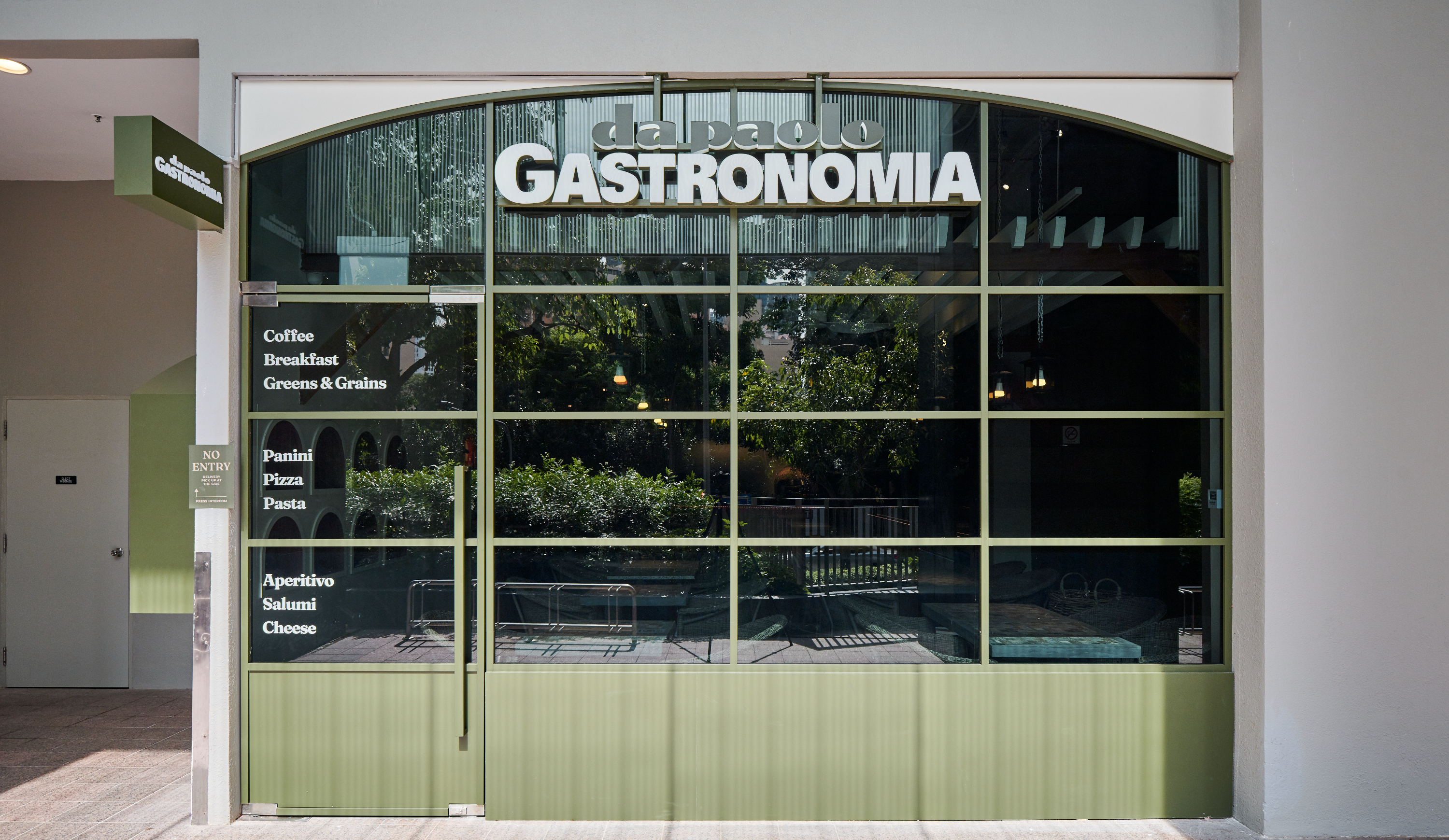
The challenge was to refresh Da Paolo Gastronomia's brand identity, store concept, and customer experience into a scalable 2.0 model. Rooted in Italian heritage yet designed for modern lifestyles, the new concept creates a seamless retail experience that feels warm, contemporary, and unmistakably Da Paolo.

Brand Rationale
Rooted in tradition and shaped for today, the refreshed identity for Da Paolo Gastronomia is a gentle evolution of a familiar classic. By refreshing the old logo with more subtle, rounded edges to make it more approachable, the mark softens without losing its heritage, inviting both long-time patrons and new audiences into the experience.
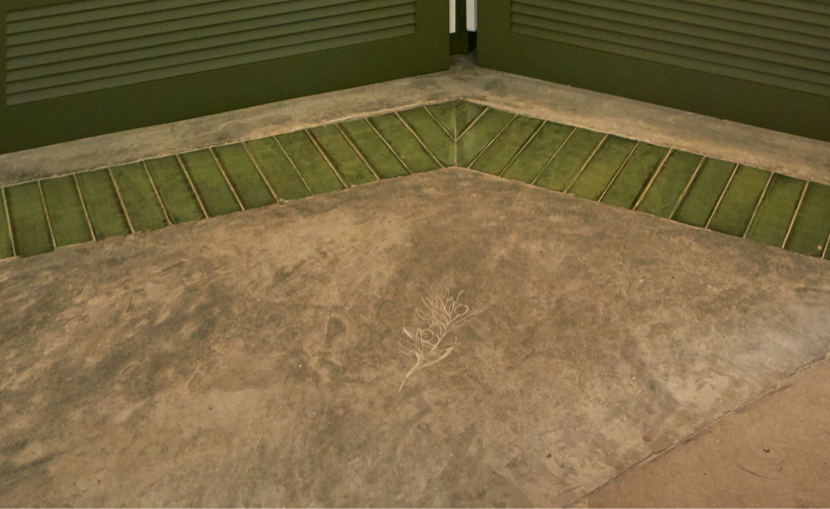
At the heart of the identity is the olive, root of Italian cuisine, a quiet yet powerful symbol of simplicity, quality, and time-honoured craft. It reflects the essence of Italian gastronomy, where honest ingredients and thoughtful preparation take centre stage.
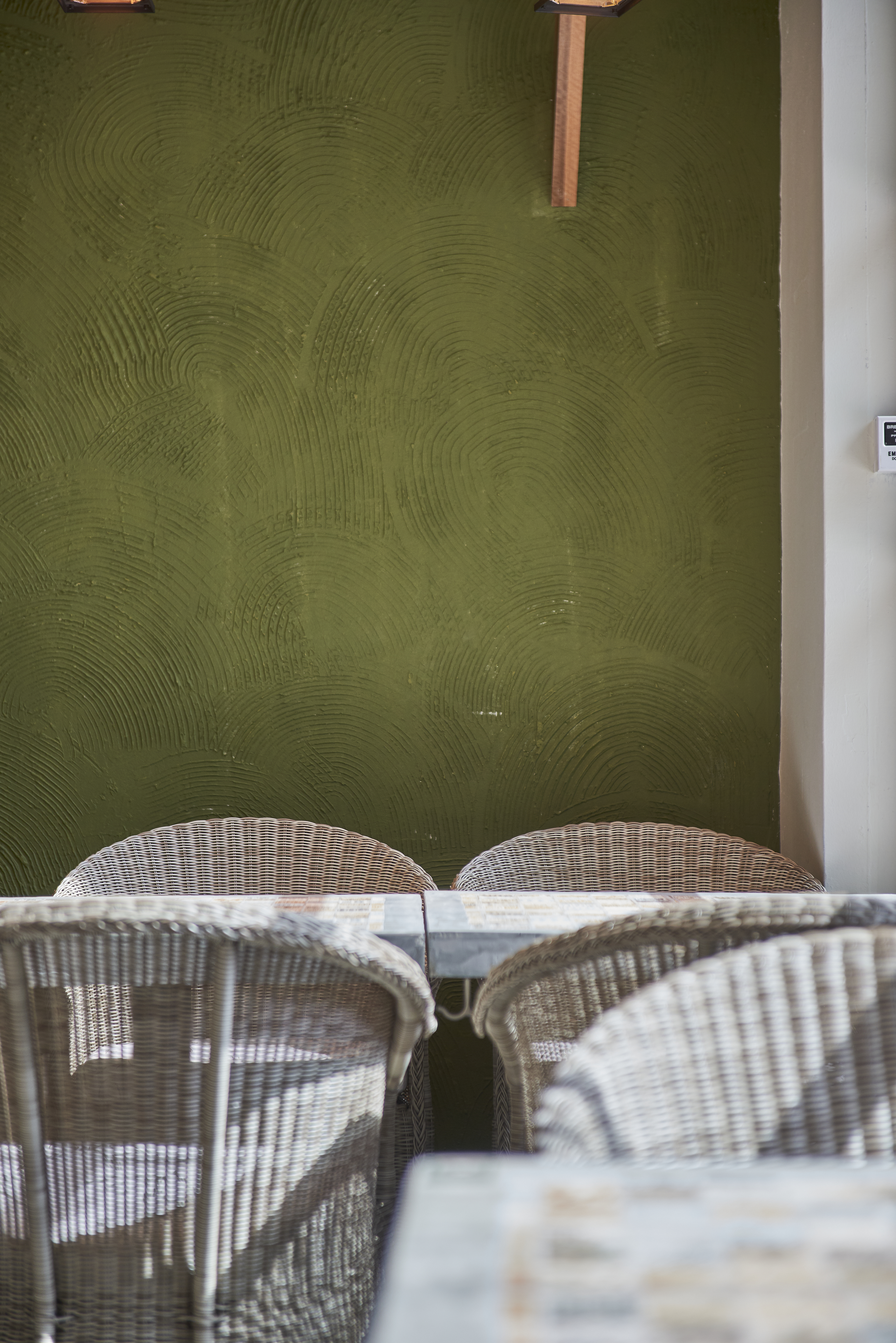
This is paired with more down-to-earth Italian colours to further accentuate the brand. Olive green, earthy tones like terracotas, and sun-washed hues echo the landscapes of Italy, grounding the brand in authenticity while bringing a sense of freshness and relevance.
Together, the refined form, symbolic motif, and considered palette create an identity that feels both nostalgic and renewed. A brand that honours where it comes from, while confidently moving forward.